I realize this is a 20+ year old game, and as such the conventions of today's designs cannot be well applied to a game this old.
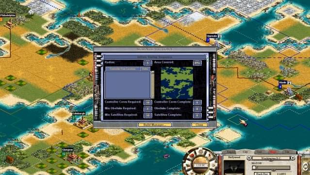
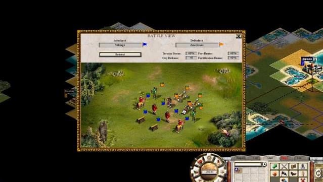
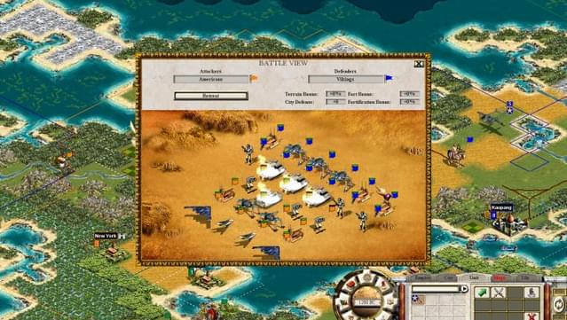
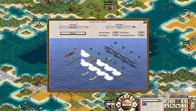
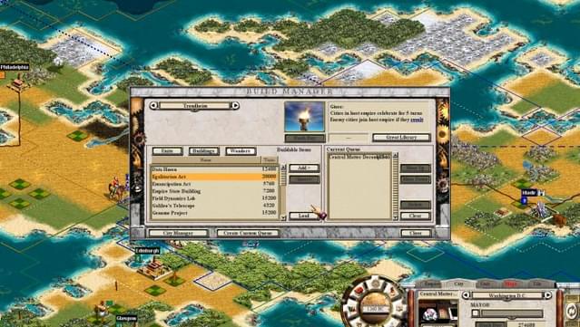
But even compared to contemporaries, it fails to present anything in either interesting or informative ways. The only positive is that the text is readable. The rest of the interface is so Skeuomorphic as to frequently slow down the game due to needing to hover over a tiny icon and wait for a tooltip.
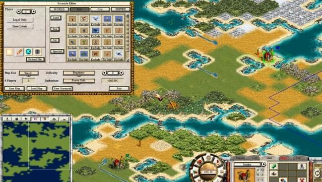
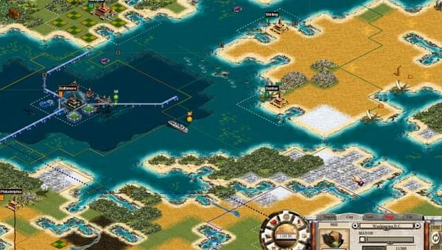
In the screenshots, that small spherical globe is your main interface, which given how poorly it scales, seems like a poor choice compared to the more menu based UI of the first game. (And other games, for that matter)
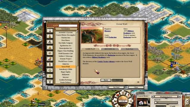
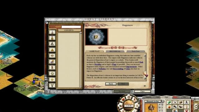
The game's encyclopaedia is bafflingly unintuitive to navigate; lacking entirely in well made hyperlinks and descriptors, which is bizarre, given the popularity of multimedia encyclopaedias at the time.
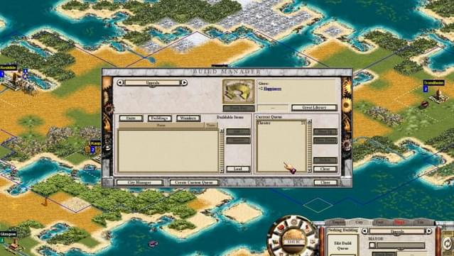
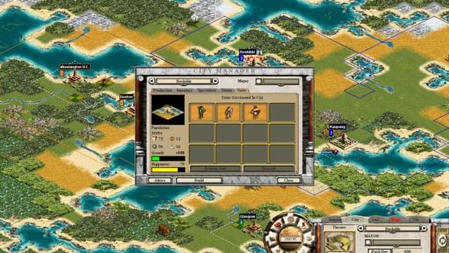
One unique aspect is the Public Works system. Rather than hiring workers to till land, build roads, and make mines, you instead invest points into building them from another naff menu. This means that rather than waiting for a route to be made because your workers are at it, you instead might find yourself waiting for enough points to accrue. And given the way the system works, it would make it unnatural to route to say, an ally.
One final thought before wrap is that the colour palette leaves much to be desired, which I would describe as bland at best, and irritatingly off at worst.
All in all, C2P2 presents some interesting twists on the normal Civ formula. Most of the are executed in an awful way.