
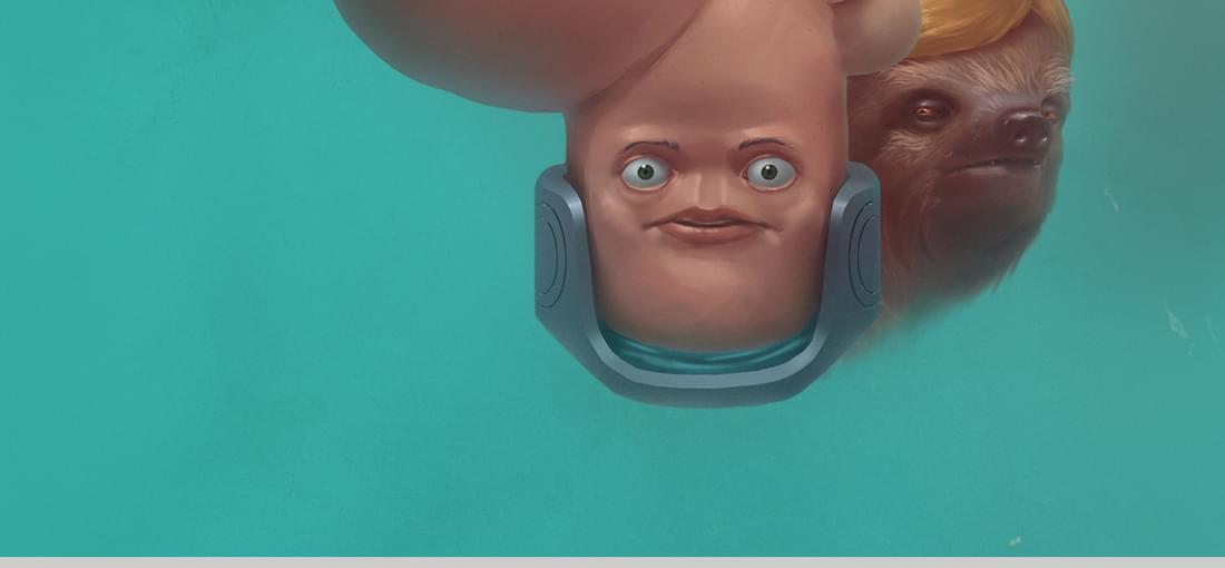
If you can get over the humour that often leaves a sour taste in your mouth, then Paradigm is a good point and click adventure game. I got fed up at the sheer number of encounters that left me squirming, needlessley I felt.

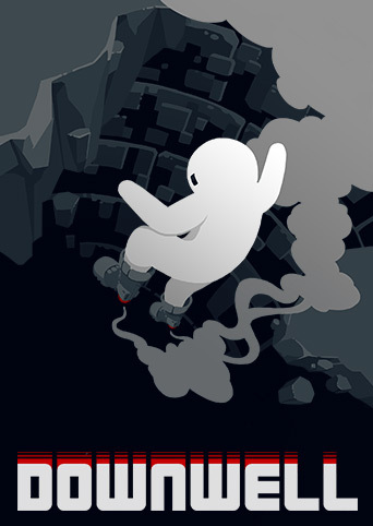
Let's get the (fake) difficulty out of the way first. It's hard because it's fast not because you need skill just as anything gets hard once you feel like life is operating just beyond what your mind can keep up with. I ran it through an emulator and slowed it down and sure enough the gameplay is not in the timing as such or learning enemy patterns or structures of the well, no no no. Your ability to button mash fast enough to stay alive is what makes this game hard. (Or can you learn to dodge a lot which also works). It's aimed at hyperactive teenagers with ADHD who have caffeine intravenously piped all day long who have run out of social media to button mash. If you're over 20, really, don't bother with this game. Leaving aside the fake difficulty, the actual mechanics of platforming are bad, often not falling off a platform when expecting too and likewise falling off when you expect the wobble animation to appear. I continually remain baffled as to why the platforming games with some awful platforming mechanics and truly foul player feedback (or lack of) consistently get whooped up. Scoring and gems are stingy. The shop appears more often when you have nothing to spend. Upgrades are a ok but weapons don't really scale or do anything interesting. Enemies are difficult to read - a combined fault of the very limited colour scheme, bad feedback to the player and the manic speed of the game. Amassing points unlocks different palettes to select (in addition to the default black, red, white) but they all look rubbish and don't solve the problems created when you have three colours in a 8x8 sprite and need to convey a variety of intentions to the player. Even with a controller Downwell is thrilling and frustrating for the first few minutes and gets dull and frustrating after that, how soon I suppose depends on old you are above 20.
The first 30 minutes of the game is tedious and confusing. Then the proper game kicks in and just remains tedious. Then you die and have to repeat the tedious and confusing bit, with less confusion this time but slightly more tedium. Repeat until you get bored and are forced to write a negative review to warn others of the massive style and pretense over substance and consideration for the player this game demonstrates. I liked the art style, it's a shame the coolness wasn't transferred to the gameplay. And it has pointless unlocks (characters), because of course it does. Crap.
First rate platforming/digging game with some tight controls and plenty of story, I could have played for twice as long and still enjoyed every minute of it.
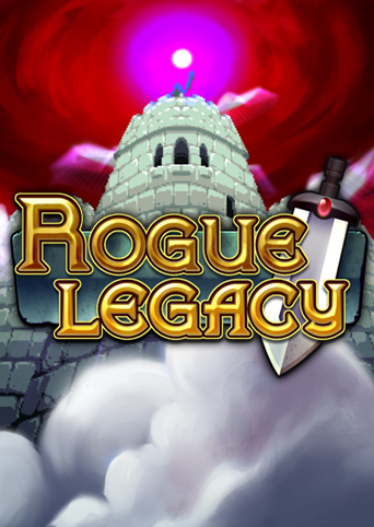
Too clumsy in it's controls, too hard with the enemies, too punishing in player death and too feeble in the upgrades it offers. The controls especially make this game suck more than it should - developers please stop using the hold down to attack mechanic, especially when it is the only way to activate wanky timed-limited platforms. Dear God - developers can you stop doing that please? Wherever this cretinous concept come from can we all send it back there from now on? The game really shows the clunky Flash legacy (good riddance to that awful software and it's retarded coding) by the jerkiness of the movements of just about everything. The response of the player is bad and the slowness of the attacks relative to the speed movement is embarrasingly bad. It's fake challenge that's neither fun nor rewarding, whatever the outcome. Upgrades are both over-priced with a barely noticable effect and worse, upgrading one stat increases the price of EVERYTHING. Worse still, there is an amazingly awful mechanic that beggers belief: if you don't spend all your money you lose it when entering the castle. So if the cheapest upgrade is say 580 gold and you've got 570, you lose it all. Developers can be dumb fucks sometimes and this idea shows it. As I write the devs already seek to correct this mess for the sequel, kind of confirms the damp mess that RG1 is really. I bought this at 75% off and feel cheated.
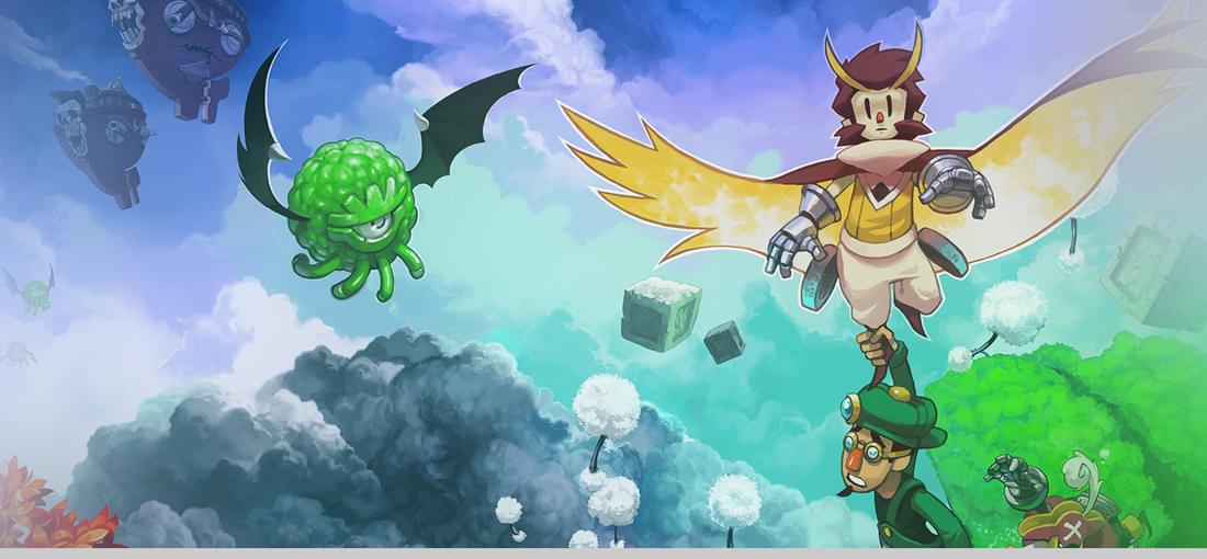
Owlboy suffers from a fatal combination of really bad controls and mechanics, to do with general exploration and especially grabbing your buddy and having to fire and dodge enemies. The game is not a twin stick shooter although it seems as though it dearly wants to be and is frustrating to get to grips with. Boss battles amplify these issues and combined with poor indication as to what to do and far too nasty/fast boss moves makes these nearly as bad as Shovel Knight, although not by much. "Story" is boring and there is no sense of excitement is in looking towards the next area...if anything Owlboy feels contained - quite stupidly so - which is a disappointing contrast to the promise offered by the titular character being able to fly. Characters seem well fleshed out but are often more decoration than anything to properly interact with or get to care about. I liked the dungeons although the combination of screen transition switching, at random, from screen slip to camera track was ghastly. I wish it would have just done one and not both. Also you collect coins but no shop - dumb - why not just called them something else that unlocks abilities? A note about the software itself - it will crash on you.
It looks nice. I like the race selection set-up and all the options available at the start. I hate the UI - it's dis-organised in a way that bears no relation to what you need to do moment to moment. Playing Stellaris at a larger resolution is even worse because it simply amplifies the blunt fact that popups and dialog choices literally come on screen from all directions in no logical order. Once you become acccustomed to the ghastly UI (I never really did) the over-whelming throbbing clicking tedium of it all sinks in. For a grand strategy to have so many little, annoying, boring choices to make is nothing short of an amazing failure. I was bored because micro-management is the gameplay loop...in this grand strategy. Dialog. Choice. A couple of stats change. Dialog. Choice. A couple of stats change. Dialog. Choice. A couple of stats change. Dialog. Choice. A couple of stats change. Dialog. Choice. A couple of stats change. Dialog. Choice. A couple of stats change. Dialog. Choice. A couple of stats change. Dialog. Choice. A couple of stats change. Dialog. Choice. A couple of stats change. Dialog. Choice. A couple of stats change. Dialog. Choice. A couple of stats change. Dialog. Choice. A couple of stats change. Dialog. Choice. A couple of stats change. Dialog. Choice. A couple of stats change. Dialog. Choice. A couple of stats change. Dialog. Choice. A couple of stats change. Dialog. Choice. A couple of stats change. Dialog. Choice. A couple of stats change. Dialog. Choice. A couple of stats change. Dialog. Choice. A couple of stats change. Dialog. Choice. A couple of stats change. Dialog. Choice. A couple of stats change. If Stellaris didn't have the dressing of it's space theme it would have sunk without a trace and wouldn't have an excuse for the crapola of DLC it offers. I was so bored with Stellaris I went digging through the installation,.... I love the fact there's an actual silence.wav sound file. Then I deleted Stellaris forever.
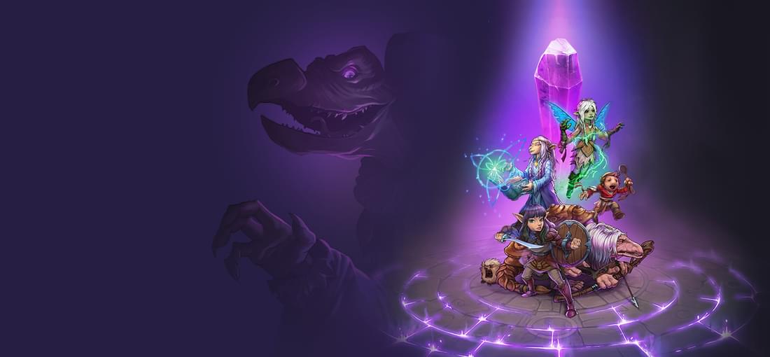
As tactics game go this one is just about passable in terms of its combat and story. The problem is that given this is based on the Dark Crystal I am struggling to understand how the end result is so thoroughly void of charm, wit, whimsy and weird cuteness. It looks bright and cheerful and yet so static and uninviting. On top of that the controls are generally awkward (especially with a controller) and it feels like they get in the way of things. Also the UI is bad and can't decide if it wants to be suitable for desktop PC or for console 3 meters away, the end result being a nasty combo of both.
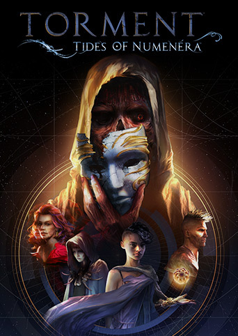
The text dump of quests is neither engaging nor compelling and I struggled to find a reason to keep going beyond the opening hour. There's a lot of concepts and stats floating around and these feel like a distraction where I want to be able to put attention towards to the story. I'd like to mention something about the characters but they are not really worth talking about. Shame because I'm sure there are some great ideas in the background but they never seem to matter from the moment to moment as I wade through another wall of text.
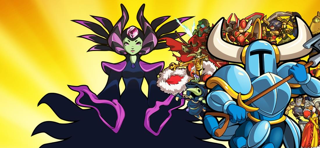
Shovel Knight is a terrible platformer - it has some of the worst collision detection I've ever come across (even worse than Spelunky or Cuphead, and that's really going some). The level design is bad with really nasty rooms that require literal nano-second precision and combined with some of the levels being in near darkness results in a frustrating and sour experience. The stages encourage exploration but that's actively discouraged by the piss poor nature of the platforming itself - frequently I just wanted to get to the end boss. The end bosses though were an excercise in dumbness and more frustration - ALL bosses jump about spasmodically, flailing their skills at lightning speed. Lazy, stupid devs thinking that bosses are just about large health and too fast to dodge attacks - you will AWLAYS loose a lot of health and that's not a challenge for the player, it's bad design. But these are not the worse aspects of the game - shovel knight's two main skills using the shovel (standing still and hitting or jumping and then pressing down to poke) are badly implemented. The shovel hitting is both slow and has some bad hit detection while the jumping and pressing down is clunky and feels difficult to pull off consistenly (as you are required to do so ALL THE TIME as it is the more reliable for hitting enemies). Playing this on controller felt awkward instead of natural. And yet the most retarded decision made about this game was the fact that pressing up does not make you jump - oh no, it triggers dialog and is used for the relics and powers. What this means is that any attempt to rebind controls and you are totally buggered as REBINDING THE DIALOG BUTTON IS NOT POSSIBLE. You will literally be trapped as rebinding the platform controls is only what you can do so if you rebind UP for JUMP you are screwed. Stupid devs. Really bloody stupid devs.