
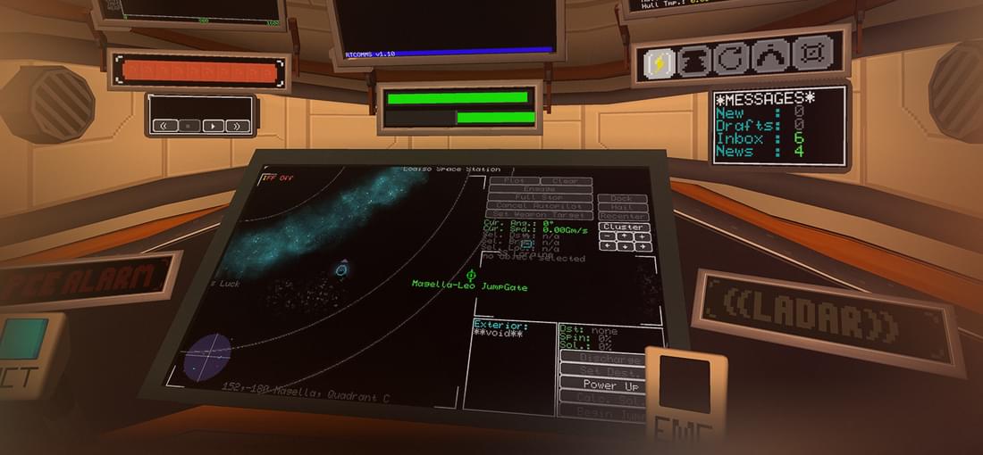
I really wanted to like this game. This modem-punk, spiritual love child of the "Silent Hunter" and "X" series could easily have entered my top 10 favorite games ever. But "Objects in Space" strains me. It's unstable and poorly optimized, and its meager ship selection consists of three ships so similar, most other games would consider them variations of the same make and brand. These and a handful of other flaws surely detract from the general experience, but they wouldn't keep me from playing the game. The UI, however: It's bad. Oh god, is it bad! While it's not technically game breaking, it certainly breaks the game for me. — Want to evaluate the sub-components of any part or ship you want to buy? Too bad. You can't. — Want to compare the components in a shop with those currently in your modules? Well, technically you can. Just write down every attribute of every part, and make a list of every part you currently have in every module. — Want to buy several pieces of the same component? Select one, press buy, select one, press buy... — Want to sell the 20pcs of identical components you just replaced? Scroll down, select one, press sell(screen auto-jumps to the top of the list), scroll down, select one... Oh and did I mention that scrolling down on the mousewheel makes you walk away from the screen? — Want consistent ways to navigate menus? So do I. It remnds me of the aftermath of a front-end "upgrade" on a previous workplace of mine. A slow-to-learn, but extremely fast and efficient text-based UI got replaced wth a sluggish GUI, wthout changing the hardware. And btter yet: They cloned the old unintuitive strcture, while removing all hotkeys and rplacing them with a mous. And tht is wht the usr intrface of "Objects in Space" feels lke, only wrse, somhw. Th imprcticl layout f an old TUI, only navigabl by th slw means f a GUI void f cnsistnt htkys nd shrtcts, nd wth a sprnklng f thrghly cntrintuitiv ctrls. Thr ar thns f mor xmpls thn thse abv, bt 'm rning ut f chr