
Thats it. Thats the tweet. FYI: I don't own it here. I have it on console.
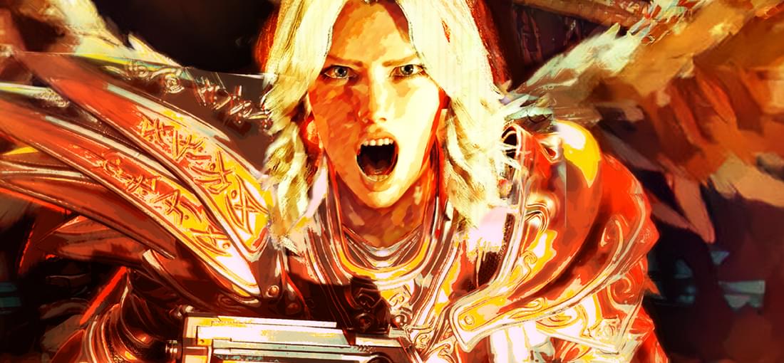
Funny saying that about a metal rhythm game, but let me explain. The main draw of the game is doing - nearly – everything to a 4 or 8 count beat. 1-2-3-4 Shoot-Shoot-Shoot-Shoot or 12-34-56-78 ShootShoot-ReLoad-ShootShoot-ReLoad Hitting flow in those moments of chaos by balancing staying on beat with surviving & outputting dps, IS the fun of BPM. This game is awesome on that merit alone. That being said, the visuals of the game make it hard for me at times to differentiate enemies from the backgrounds. The Levels are all stylistic firey reds, blacks, oranges, yellows, etc. The enemies are also colored in similar reds, blacks, oranges, and yellows. They have a little glow about them, and its not impossible to tell enemies from floor tiles, but many a time I've walked past a slug or a spider I just didn't see and took damage because of it. Totally my fault, I am sure of it. Maybe I was in the zone and missed them. But I feel if they were in more contrasting colors, it would make it easier to keep track of them. They might clash with the descending into firey Norse hell aesthetic the designers seem to be going for though. I also wonder how friendly this color pallet is to colorblind players. Good arcadey fun regardless. Just keep your eyes peeled. FYI: I don't own it on here. I have it on console.