
I was looking forward to this game after hearing some good reviews. But it was not, at all, what I expected, and not in a good way. First of all, the UI/UX is so poorly done that I actually had to end the game by having Windows kill the executable because I could not figure out how to get out of the first screen. Then I realized that you have to click like 4 things just to exit (not intuitive at all), I tried the game again, and ran up against more horrible UI/UX. For example, in the tutorial you have to alternate between mouse and keyboard just for the most basic navigation (you have to press the 'S' key to see your cards, even though there is a big 'S' icon that you can click on with your mouse). Not great especially if you have a disability that makes keyboard/mouse switching difficult. Why would the designer force the user to switch like this? Does it contribute to the game experience??? Then I gave it a third try, and again ran into so many little issues that made the game play unenjoyable. And keep in mind this was in the first part of the game, which according to other reviewers is the BEST part of the game! I've played video games for forever and designed about a dozen of my own. I can't for the life of me understand why the designer made the decisions he or she made. Just not fun. I'm sorry, I don't like leaving bad reviews, but save your money for something else.
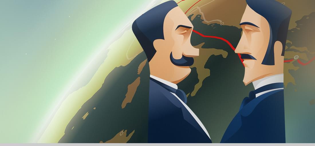

I love this game, and only found out about it recently from a game blog. I've always liked interactive fiction going back to Zork 1 and choose your own adventure books. I recommend this game to everyone. However, as you play you may decide, as I did, that Fogg is pretty much just ballast. If there was an option to throw him from a ship, I'd choose it in a heartbeat.