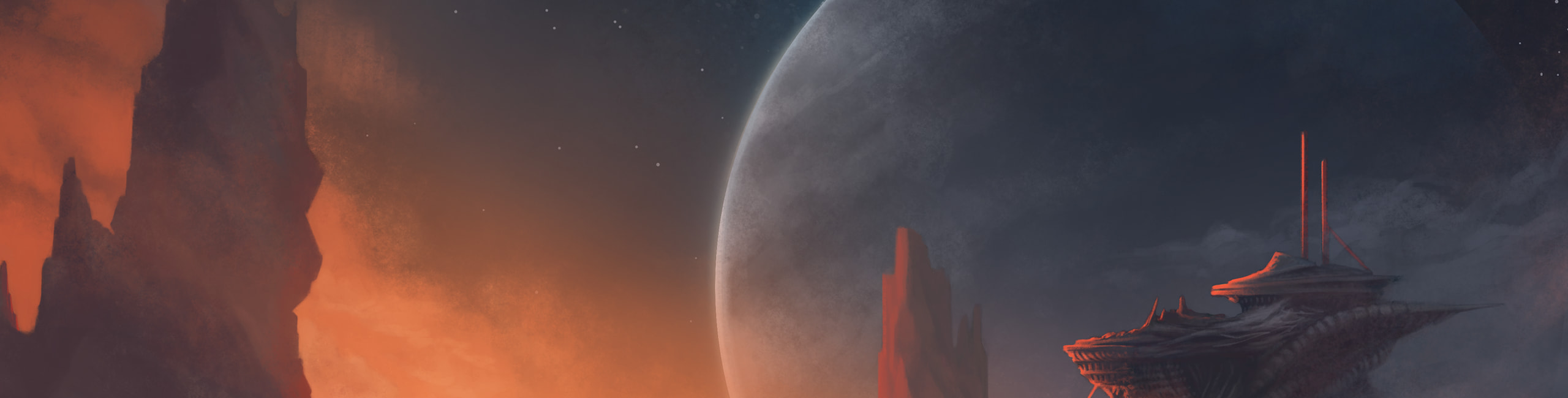
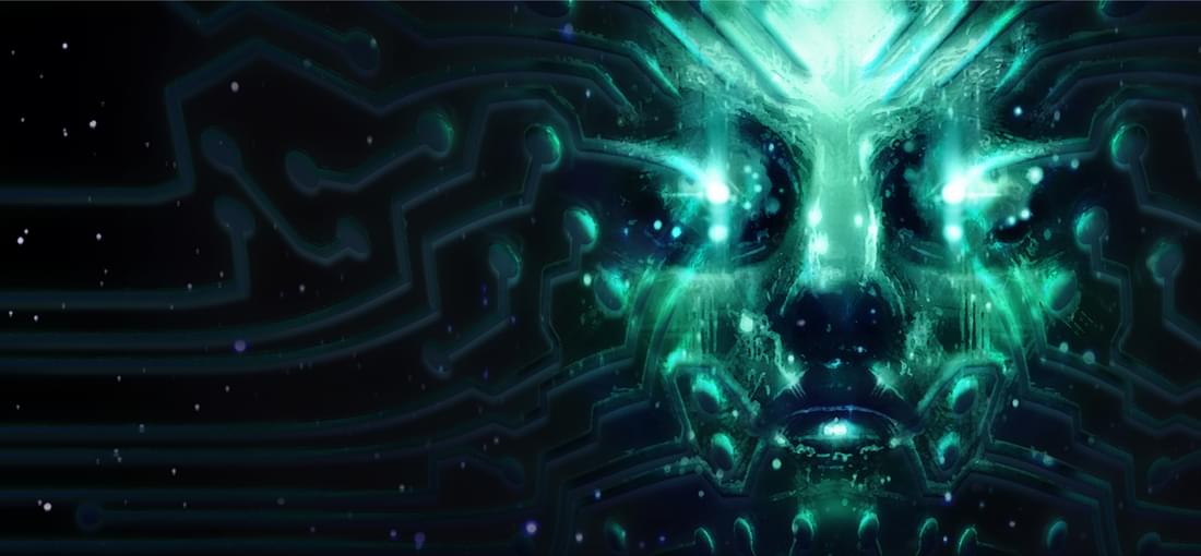
This demo includes the complete Medical level of the game (barring the cyberspace section and one enemy type). This is an alpha build, so I will of course be ignoring glitchiness and general rough-around-the-edges-ness. I first played and completed System Shock 1 with the Enhanced Edition late last year, and while I had a few gripes I had a pretty good time with it. Hopefully I can give a more objective impressions without the nostalgia goggles. Highlights: - Doesn't fix what ain't broken. Item placement and level design are all just as I remembered them. - The few additions that are here (restrooms, cyborg surgeons, and a nice view of Saturn) are great. Really ties the space together in what would otherwise be empty corners. - Atmosphere seems to be much more horror-oriented, more in line with SS2. - Inventory system also lifted from SS2, which is a definite improvement over the original. - Jesus, cyborg assassins are TERRIFYING now. Concerns: - Like others have noted, the combat isn't great. Melee range is too short, very little feedback on hit, etc. This is probably going to be fixed. - Grenades are not handled well. Equipping them throws them immediately, which I was never able to get used to. - I can't decide whether the mutants look creepy or goofy. What's up with the quarters in their eyes? - Some of the items are hard to see. I walked right over the pistol and magpulse the first time because I couldn't see them in the dark (this may be why some people think there's a two weapon limit, not quite sure). - There are lots of little items lying around you can't pick them up, which makes it a little difficult to single out the ones you can and runs contrary to the original's design philosophy. Aside from a few gripes, this looks like it's going in the right direction. It seeks to recreate the original with updated graphics and mechanics without trampling its art direction. This game has had a rough development, but it may finally be on the right track.
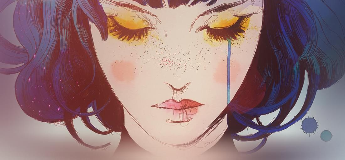

It took me a little while to figure out what I didn't like about this game, because I normally have no issue with games with artsy ambitions. After all, playing through Abzu was one of my favorite gaming experiences ever. I don't always love puzzle platformers, but that didn't stop me from thoroughly enjoying Limbo and Inside. It took me about a week after the credits rolled to realize what it is about this game that doesn't work. Gris is a by-the-numbers puzzle-platformer that does the bare minimum it takes to make a successful art game. Sure, the artwork is "good" in the sense that you can take a screenshot of just about any point in the game and get a pretty good wallpaper out of it, but none of the environments struck me as appealing. I like the watercolor aesthetic and the use of color is especially good, but I struggle to remember any single area of the game that stuck out to me. You've got your bland ruins, your bland desert, your bland forest, etc. I'm surprised to see people praising the music. This game opts for an ambient soundtrack, which isn't bad per se, but it doesn't make for any memorable tunes. They also used some low quality samples that I found distracting (I know a real cello when I hear it, and that ain't one). The gameplay is also very basic and doesn't feel good. This is to be expected from art games, but games like Abzu demonstrate that art games can still feel amazing while Gris makes no such effort. And of course, the theme. Each of the games five areas is intended to be symbolic of - you guessed it! - the five stages of grief. That's about as standard of an art game theme as you can get. And that's not to say that grief shouldn't be explored in art games, but the five stages especially are so overdone and just serves to drive home the cookie-cutter nature of this game. To be fair, there's nothing egregiously bad about Gris. But if you're looking for an artsy game that works as both a game and art, look elsewhere. Gris works as neither.
Full disclosure: I didn't like Quake II. The gunplay didn't hook me like the first one, and the dull enemy and level design only lessened my interest. Quake IV is a direct sequel to that game. So, is it better or worse?...well, I feel about the same way about this one. I actually took the time to beat this one, which is more than I can say for Quake II, so I guess that's saying something. Also, I am basing this review on the Steam version. In terms of aesthetics, Id Tech 4 has aged reasonably well for an engine from that era (assuming you changed the .cfg file for the HD textures). They really amped up the body horror for the Strogg, which in all honesty I didn't care for. I tend to be pretty squeamish about this sort of thing. In terms of level design, it hasn't improved much. Everything still looks and feels the same. Gunplay is much slower than other Quake games, at least until about halfway through when THAT event happens. If you've played it, you know the one I mean, and even after that it feels a little slow. As for the feel, everything feels pretty good for the most part. The big problem here is that it often doesn't feel quite Quake-y enough for me. Once you aren't on foot though, the vehicle and turret sections take way too long, and aren't any good. So that's a problem. In conclusion, if you liked Quake II, you will probably like Quake IV. As for me, it's just not my thing.