
Posted on: December 15, 2019

phekdra
Владелец игрыИгр: 91 Отзывов: 2
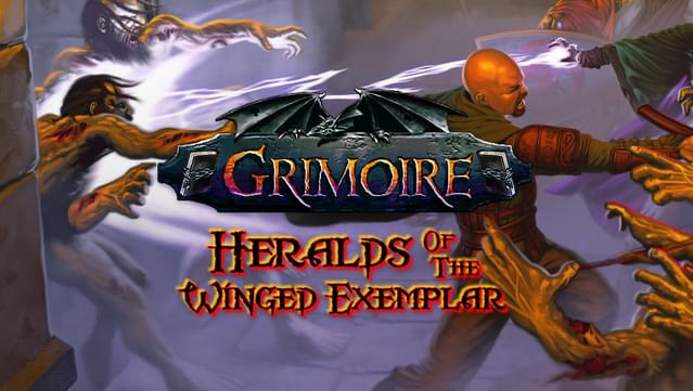
It's Wizardry
It's not a joke - it really is as good as the best Wizardry games.
вам это показалось полезным?
(c)1994-2019 Golden Era Enterprises All Rights Reserved Internationally
Posted on: December 15, 2019
phekdra
Владелец игрыИгр: 91 Отзывов: 2
It's Wizardry
It's not a joke - it really is as good as the best Wizardry games.
вам это показалось полезным?
Posted on: December 12, 2019

ERYFKRAD
Игр: 1112 Отзывов: 3
Itz good.
Unscaleable, unfathomable, incalculable, immeasurable incline. Haven't played anything as charming as this in a long time.
вам это показалось полезным?
Edited on: September 19, 2025
Posted on: November 11, 2020

dnovraD
Игр: Отзывов: 76
A spearpoint burial for the eyes.
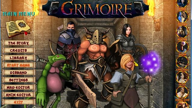
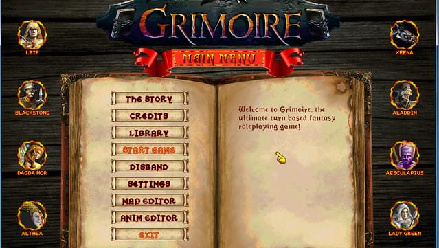
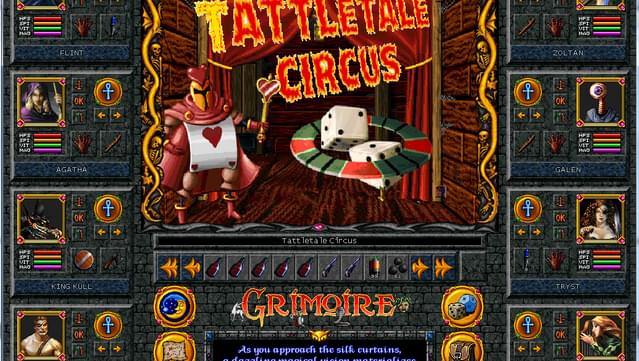
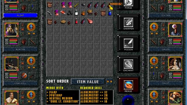
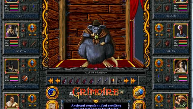
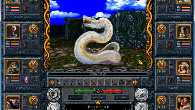
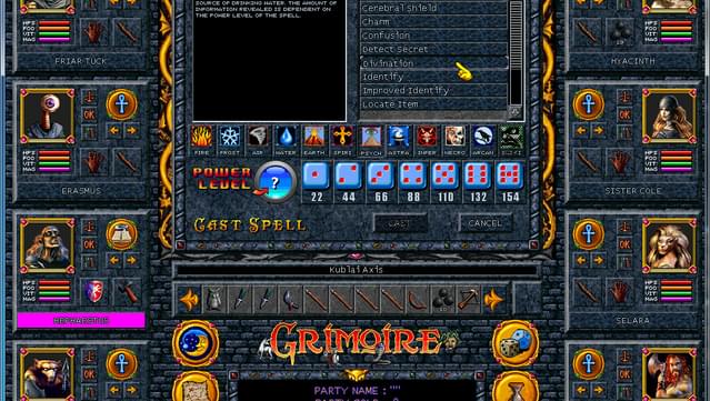
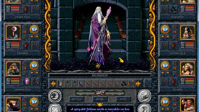
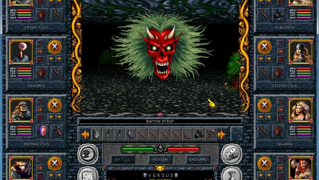
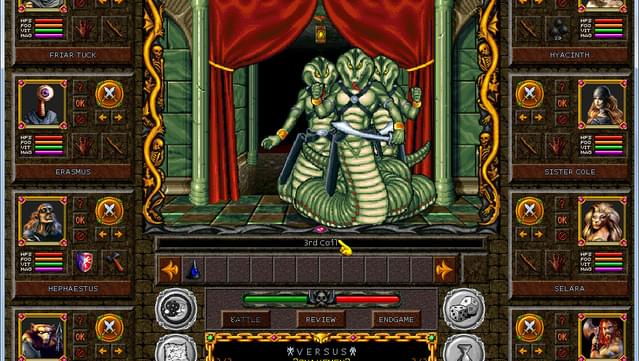
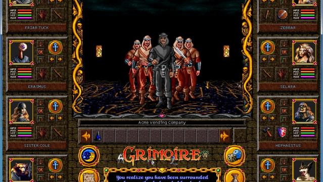
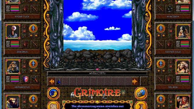
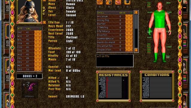
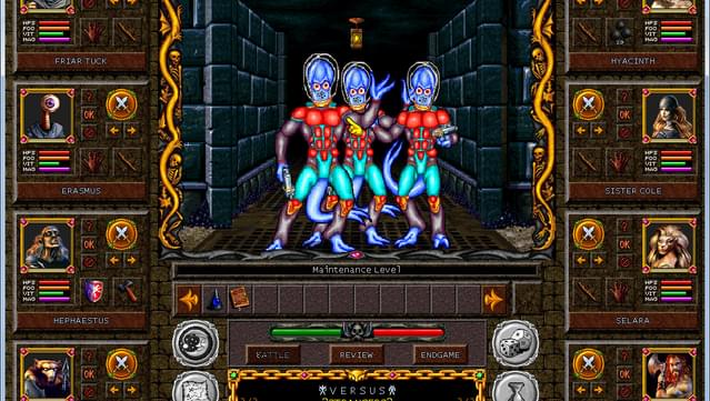
This game is ugly: From basic concepts such as buttons not having visible hitboxes to glaringly garish colour choices right down to the basic visual consistency which is non-existent. One could perhaps make a claim of this being outsider art; but even that is subject to the ideals of usability in a working product. A good sign of things to come has to do with how the starting screen is laid out. When one uses pulldown memus, the typical first option is some variation on New. Grimore puts Start Game four options down. From there, the basic failure to conceptualize ideas of navigation continue. The main screen presented and the attack on the eyes continues. starting with more dazzlingly unreadable fonts, hideously sharp icons, and yet more mismatching visual styles. But it only gets worse. Up to this point, the only bit of visual consistency is that everything is laid out in ugly beveled squares. Except for the garish yellow buttons. Once you're in the inventory workshop, it all becomes rectangles. AND LOUD TYPEFACES THAT FAIL TO EXPLAIN ANYTHING USEFUL. See the thing about good interface design is that explaining what the thing does is a failure. What I can glean is that there a lot of ?untranslated variables? that were never put into cleaner language which just looks sloppy. Within the combat interface, we're presented with a murder mystery. The body of the interface lies upon the table, and the dissection reveals it died of information starvation. In most dungeon crawlers, you have a running combat log or some kind of hitting indicator. Of course, this may be hard to notice among another lay of abstraction, the constant noise given by your opponent. Grimoire's combat is a slow tedious joke of too many selections. Oh boy, the options. Tell me. Is purple on brown easy to read? Do typical option toggles make you click though each one before cycling around? No. They don't. Grimoire is a throwback of worst ways possible, combining the worst of interface design.
вам это показалось полезным?
Posted on: May 28, 2022

ml107
Владелец игрыИгр: 35 Отзывов: 1
higher resolution not supported
It might be a great game, but the way it handles screen resolution and the limit to 1024x768 makes it unplayable on my system. Refund requested.
вам это показалось полезным?
Posted on: December 18, 2019

silentsigil
Игр: 185 Отзывов: 3
Own on Steam
Actively insulting of the player's time via its base systems. Yes, a manual exists. No, it is in no way adequate for the character creation. At last check the game's major gimmick systems weren't working (spirit bar nonexistant, vitality hateful design to waste time). People will argue that these do work, and since this is "3.0" they very well might. Like as not they still don't. I may have to do a fourth playthrough to see if this version is finally worth the 60 hours a full exploration takes (most of which is spent sleeping and skipping combat) and edit these reviews.
вам это показалось полезным?
Что-то пошло не так. Попробуйте обновить страницу.
Отзывов по данным критериям не существует
Error loading patrons. Please refresh the page and try again.