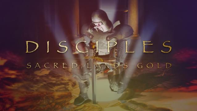
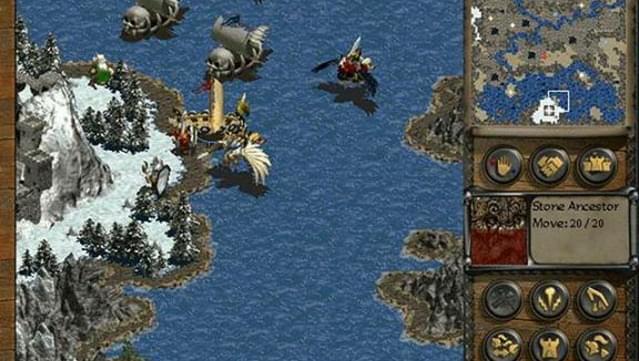
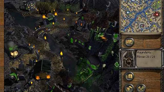
It is the dawn of a new age. The most momentous of wars has begun in the heart of the Sacred Lands. Four factions - the Empire, the
Mountain Clans, the Undead Hordes and the Legions of the Damned -
stand ready for battle as they fight for the survival and dominance
over their war-torn world, and the...
It is the dawn of a new age. The most momentous of wars has begun in the heart of the Sacred Lands. Four factions - the Empire, the
Mountain Clans, the Undead Hordes and the Legions of the Damned -
stand ready for battle as they fight for the survival and dominance
over their war-torn world, and the gods they have long believed in.
The Mighty Lords watch silently as their Disciples prepare for the
daunting tasks ahead. Each warrior must engage in a struggle of
swordplay, sorcery, and uncommon courage in order to complete their
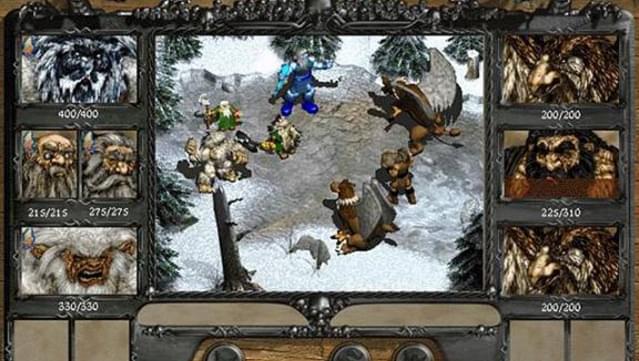
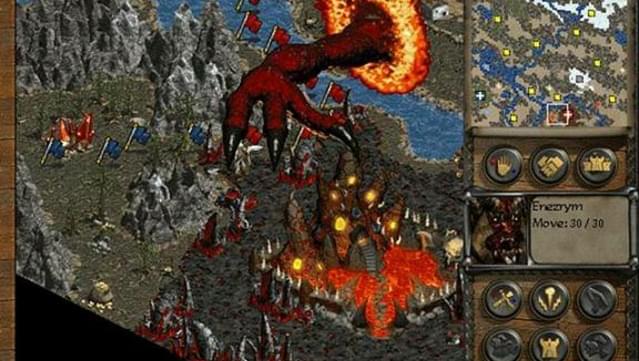
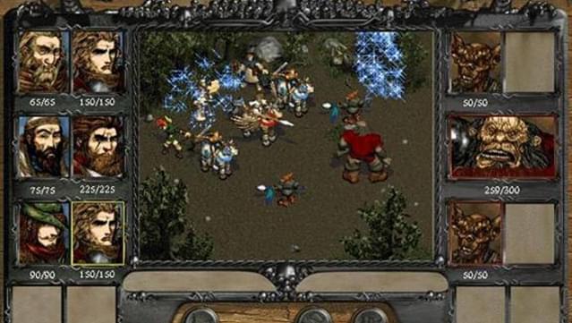
sacred quests. The Empire fights to secure their people's future; The Mountain Clans search to regain their rune knowledge; The Undead Hordes seek revenge for their accursed god; and The Legions of the Damned battle to resurrect their fallen angel's soul. It is a struggle of desperation.
Every stroke of a sword, each blast of fiery magic must be endured
beyond exhaustion. For once the clouds of destruction clear, lands
will have been transformed, new armies will have been forged and the cheers of the liberated will resound throughout the land.
The day of reckoning has come... Only one side shall claim victory.
Only the chosen will survive.
The Gold Edition includes 25 new scenarios and multiplayer functionality
Immersive gameplay with a powerful “one more turn factor”
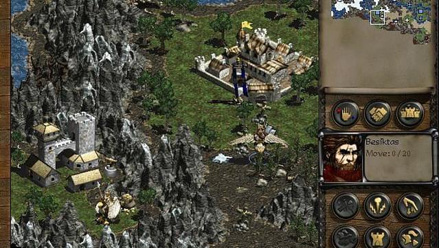
A mix of turn-based strategy and RPG in which your characters and units gain experience
Please be advised that Windows 10 operating system will receive frequent hardware driver and software updates following its release; this may affect game compatibility
Recommended system requirements:
Please be advised that Windows 10 operating system will receive frequent hardware driver and software updates following its release; this may affect game compatibility
Why buy on GOG.COM?
DRM FREE. No activation or online connection required to play.
I love this game, the combat is simple and its a slow paced title. Unfortunately, the game is completely broken on Windows 11. It crashes to desktop and refuses to work. (SmartHeap error, CTD)
I hope that in the future this becomes addressed.
While I see the appeal in levelling small warbands up, I found Disciples simply lacked tactical depth and options both in and out of combat. Personally I would recommend any of the Heroes of Might and Magic games many times over this one,
It's a turn based tactical RPG set in a fairly generic fantasy universe. This game series seems to get a lot of love on here and from other classic gamers but I'm not sure why. Maybe I just don't understand the nostalgia but there's really not much there in terms of story or setting, and the game doesn't tell you what you need to do in-game, which, maybe it's my fault for coming at this from a modern perspective, but I don't want to read a 90 page manual to understand how to play the game. I'm not rating this lower, because I fully understand that this just isn't my cup of tea and it'll likely appeal to other types of gamers, but that's just my two cents.
NOT RECOMMENDED. It is very annoying and boring and just another difficulty-padded Heroes clone, with the same color-mess-up bug from Alt+Tabbing as in Age of Wonders 1. he user interface is so bad I needed to thoroughly research the manual to learn how to recruit units, the most vital action of all Heroes clones. Here's how it was done: go through the city view to the army view, then click on an unfilled unit stack slot on the city's garrison slots (it has a diamond mark on it) and a recruitment menu appears out of nowhere. That's about five steps too much, instead of just one.
Frankly, I did not make it very far into the game (the UI has many other problems, e.g. the map units drowning into the similarly-colored decorative map graphics). The last straw was how the enemy, with full unit stacks from the get-go, of course. Attacks me out of nowhere and kills me. This underlines the sheer quantity of anti-fun this game is.
Before Turn 8. These "all-seeing eye" and "early game crunch" kinds of forcibly-game-extending game design (you have to play slow, steady and optimally to have any chance of survival) is mostly obsolete and was not exactly fun even back in the day. They were popular DEVELOPER-SIDE because they let the developer substitute diverse and well-designed content with rapidly-replicatable, intentionally unfair maps. If the maps weren't this super stacked against the player, the player might notice that the campaigns were only 4 to 6 maps long and that the narration is ridiculously serious, as per the stereotypical boring D&D narration traditions.
This game is waiting for a review. Take the first shot!
{{ item.rating }}
{{ item.percentage }}%
Awaiting more reviews
An error occurred. Please try again later.
Other ratings
Awaiting more reviews
Add a review
Edit a review
Your rating:
Stars and all fields are required
Not sure what to say? Start with this:
What kept you playing?
What kind of gamer would enjoy this?
Was the game fair, tough, or just right?
What’s one feature that really stood out?
Did the game run well on your setup?
Inappropriate content. Your reviews contain bad language.
Inappropriate content. Links are not allowed.
Inappropriate content. Content contains gibberish.
Review title is too short.
Review title is too long.
Review description is too short.
Review description is too long.
Not sure what to write?
You cannot save your review due to the following reasons:
You need to select star rating
You need to enter review title
You need to enter the content of your review
Show:
5 on page
15 on page
30 on page
60 on page
Order by:
Most helpful
Most positive
Most critical
Most recent
Filters:
No reviews matching your criteria
Written in
English
Deutsch
polski
français
русский
中文(简体)
Others
Written by
Verified ownersOthers
Added
Last 30 daysLast 90 daysLast 6 monthsWheneverAfter releaseDuring Early Access
Your review should focus on your in-game experience only. Let the game stand entirely on its own merits.
Avoid noise
To discuss topics such as news, pricing, or community, use our forums. To request new games and website or GOG GALAXY features, use the community wishlist. To get technical support for your game contact our support team.
Critique responsibly
To keep our review sections clean and helpful, we will remove any reviews that break these guidelines or our terms of use.
Ok, got it
GOG Patrons who helped preserve this game
Error loading patrons. Please refresh the page and try again.