Posted on: July 2, 2017

MisterSpanky
Verified ownerGames: 213 Reviews: 25
Feels like a demo
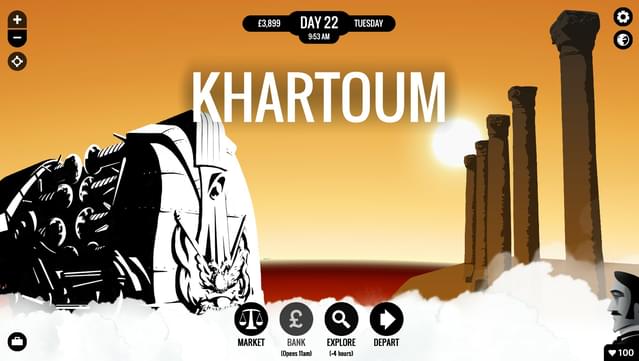
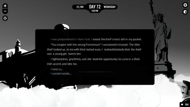
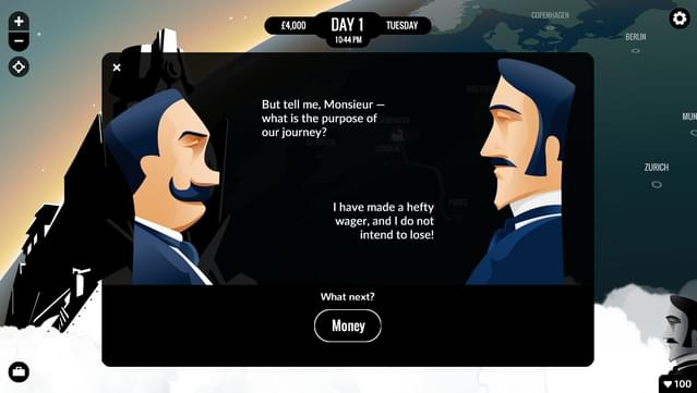
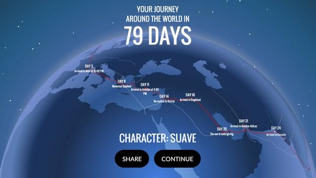
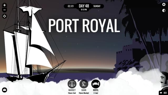
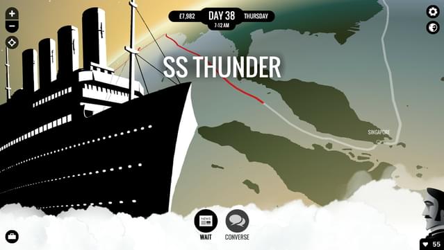
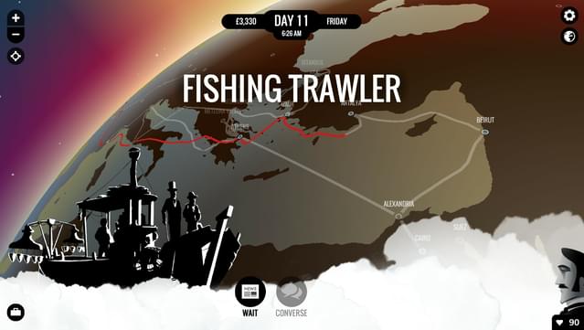
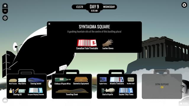
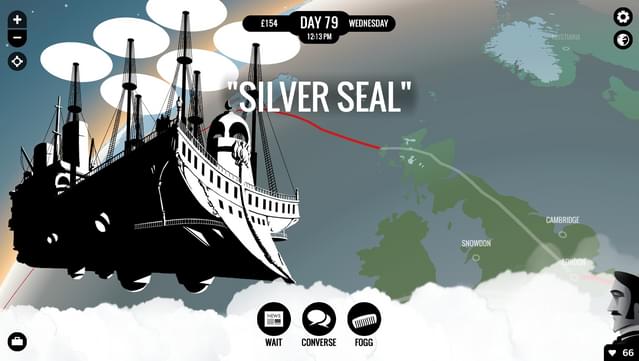
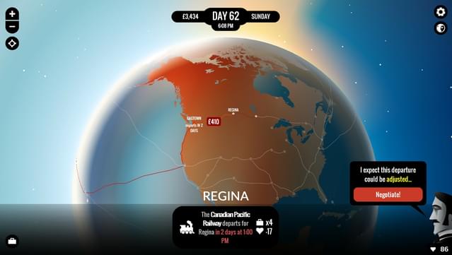
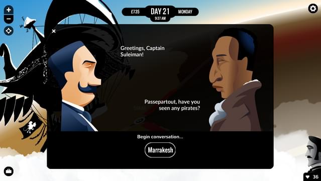
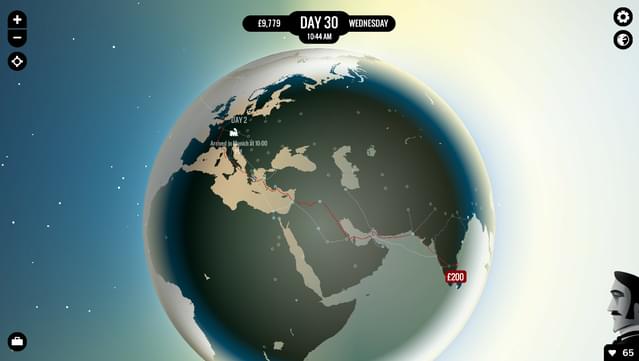
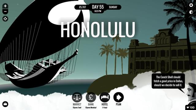
Minimalistic style is an art choice and can be liked or not, but in this case the design is so simplistic and reduced to the bone it lacks any personality. The world map design is bland and navigating is just boring. The static 2d illustrations have a completely different style, black and white with high contrast, which clashes yet again with the face to face portrait dialogues with colored gradients. User interface and basic user experience are completeyl lacking: in the first minute the palyer is presenetd with three different interaction prompts: a dark-blue link with a dark-yellow hover intearaction; quickly followed by a down pointing gray arrow that barely changes intensity on interaction: third and last is round button, already checke out , that needs to be clicked again so it switches to a green background. Basic errors that no prefessional should ever made. Gameplay wise the most common ineraction is reading text, which is too thin and has bad aliasing. Same problem suffered by the only 3d object in the game and even the 2d illustration. No settings to change that. Storywise, the random encounters often start and finish in the span of a few days and its ok, but there is a major accusation point against the traveling protagonist and it gets never addressed, not even when failing the journey and immediately prompting the users to start a new run. Careful planning can be destroyed by rng encounters and can quickly tranform a somwhat passable gaming experience in a waste of time. It feels like a project slapped together by a bunch of high school students at its first year.
Is this helpful to you?
